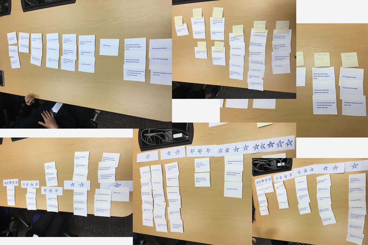
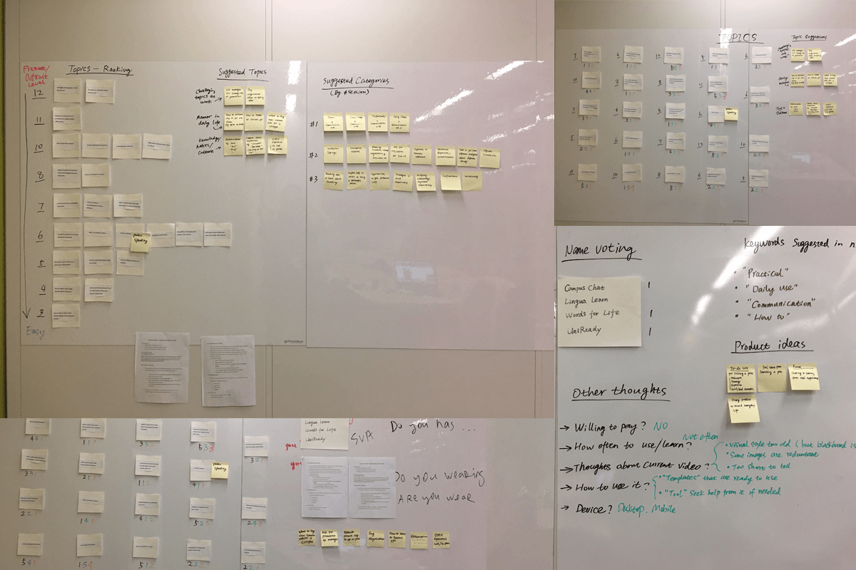
Research to validate the product scope
During the process of validating the product scope and understanding users' needs, I designed and conducted multiple user interview sessions. Through activities like card sorting and grouping, I explored their mental models, the topics they were interested in learning, their willingness to pay for educational products, and their feedback on the previous desktop version.
After the research sessions, I summarized the outcomes and displayed them on the office wall for review and discussion by the team.
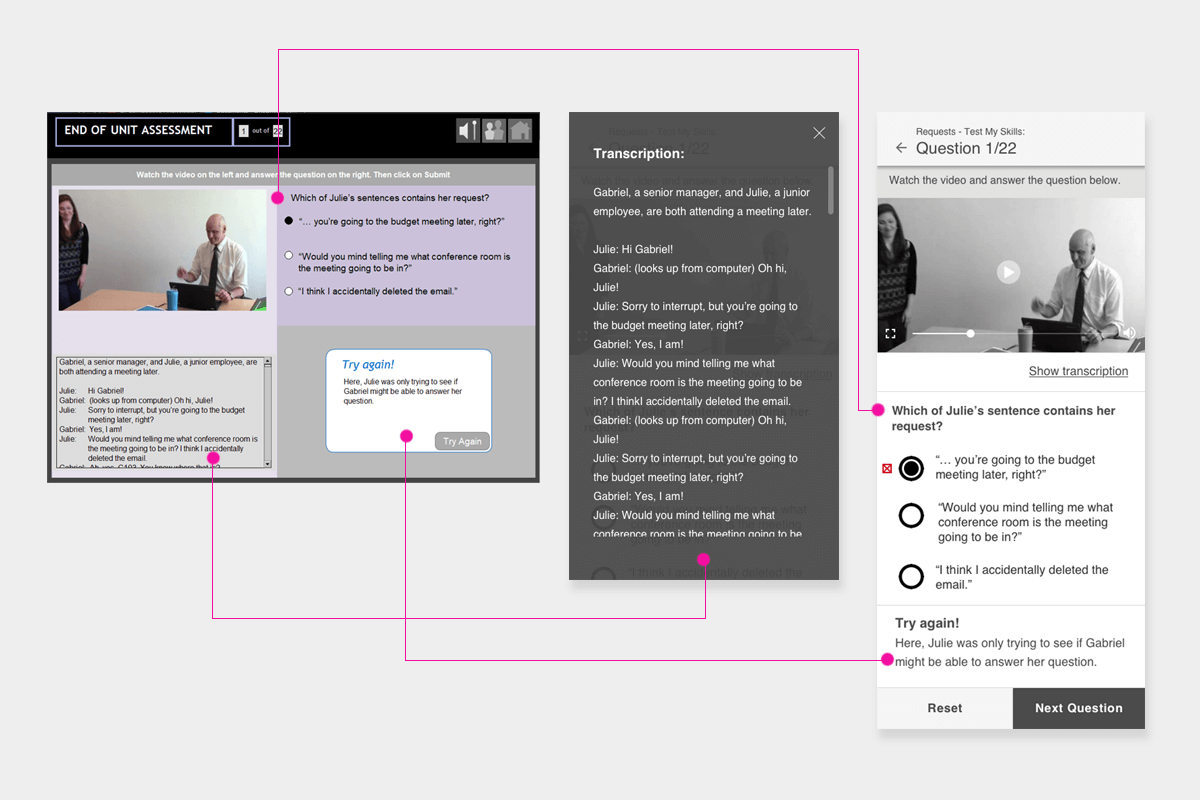
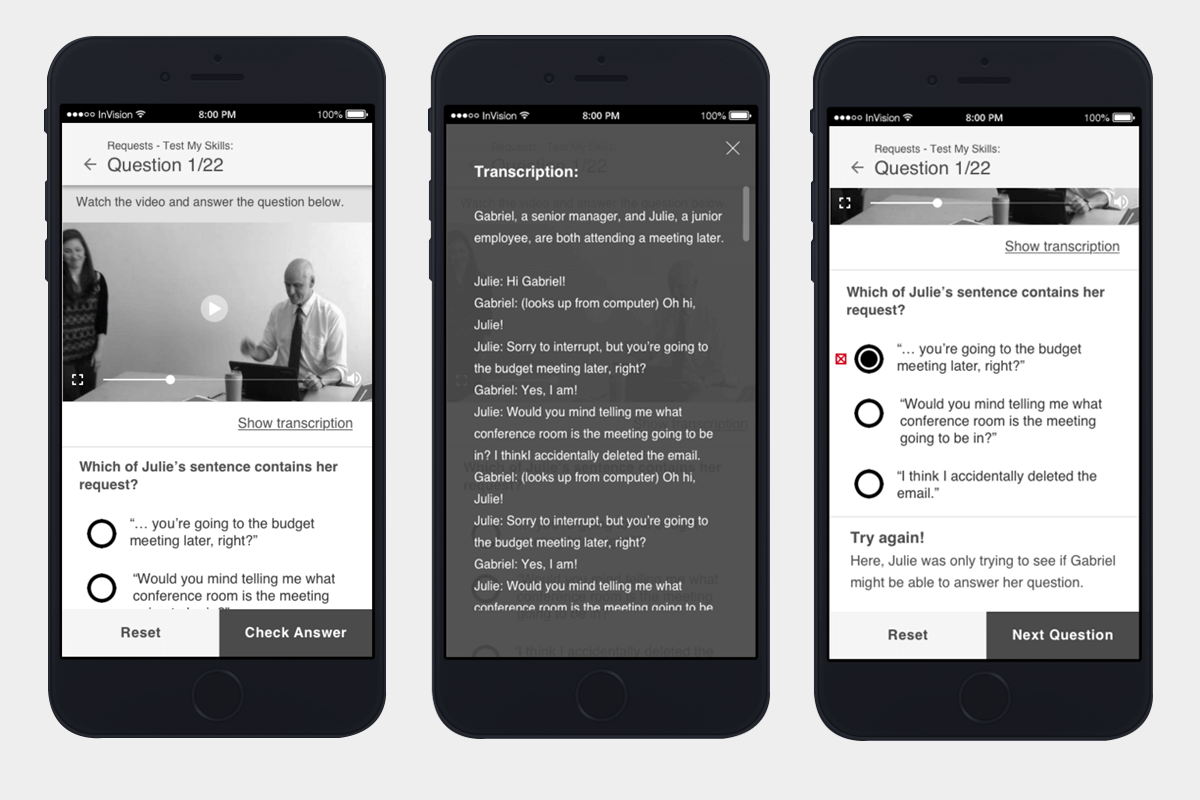
UI redesign
While the old desktop version consisted of over a hundred screens, many of the interaction elements were highly repeatable. My focus was on adapting them to fit smaller touch screens.
For instance, when the desktop version had multiple related UI elements, I grouped some of them in the mobile version. For nonessential items that didn't need to be constantly displayed, I utilized a lightbox. When users checked their answers, the feedback module appeared right above the essential call-to-action buttons to ensure it wouldn't go unnoticed.
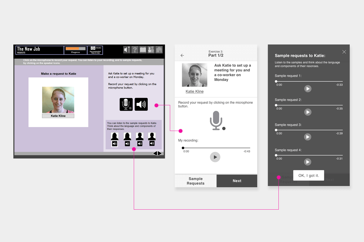
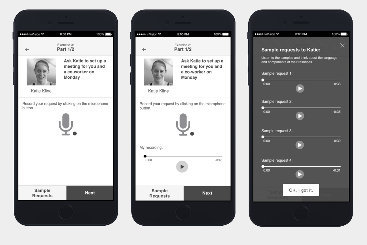
Keep the major UI highlighted
One screen in particular featured a primary audio player, several smaller audio players, and functionality for recording and replaying.
When transforming these elements into mobile screens, it was crucial to keep the most critical elements in prominent positions. I placed the reference audios in a button so that they wouldn't clutter the screen but would still be easily accessible when needed.
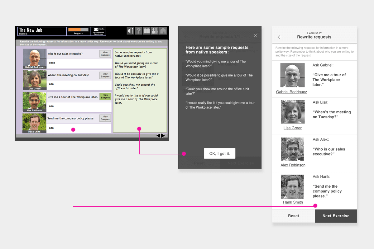
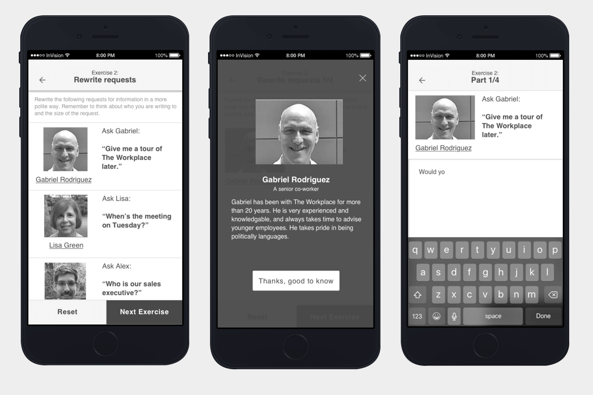
Use UI hierarchies to keep a clear IA
The challenging aspect of this screen was the presence of multiple layers of elements that needed to be grouped and displayed as they were. Given the limited space on mobile screens, I added simple navigation to maintain the information hierarchy. As long as the clue to click around was clear, presenting each element on a smaller mobile screen was relatively straightforward.